Dan Reynolds
@typeoff@typo.social
New-ish Wuppertaler and a research associate the Johannes Gutenberg University in Mainz. I teach typography and design stuff but spend most of my time looking into late-19th and early-20th-century German typefounding.
0
Followers
0
Following
Joined November 05, 2022
Website:
Instagram:
Posts

Dan Reynolds
@typeoff@typo.social
New-ish Wuppertaler and a research associate the Johannes Gutenberg University in Mainz. I teach typography and design stuff but spend most of my time looking into late-19th and early-20th-century German typefounding.
typo.social
Dan Reynolds
@typeoff@typo.social
New-ish Wuppertaler and a research associate the Johannes Gutenberg University in Mainz. I teach typography and design stuff but spend most of my time looking into late-19th and early-20th-century German typefounding.
typo.social
@typeoff@typo.social
·
Mar 30, 2026
@stabi_berlin @tiro_j This is the first re-used image that I‘ve found so far.
View full thread on typo.social
1
0
0
Dan Reynolds
@typeoff@typo.social
New-ish Wuppertaler and a research associate the Johannes Gutenberg University in Mainz. I teach typography and design stuff but spend most of my time looking into late-19th and early-20th-century German typefounding.
typo.social
Dan Reynolds
@typeoff@typo.social
New-ish Wuppertaler and a research associate the Johannes Gutenberg University in Mainz. I teach typography and design stuff but spend most of my time looking into late-19th and early-20th-century German typefounding.
typo.social
@typeoff@typo.social
·
Mar 30, 2026
I don’t know if this is gonna float anyone else’s boat, but it made my afternoon! The @stabi_berlin@openbiblio.social just uploaded its digitization of a specimen for Ramses, a serif typeface designed by Hermann Delitsch for Julius Klinkhardt around 1912. The specimen’s title page features a stylized ornament that depicts Pharaoh Ramesses II. I instantly recognized it! H. Berthold AG acquired Klinkhardt after WWI, and Joseph Tscherkassy – a Ukrainian-Jewish former typefounder who fled to Berlin during WWI – reused it on a page from his 1924 specimen of H. Berthold AG’s Hebrew and Yiddish typefaces. I instantly recognized it from that catalog. In some quarters, it is considered the most beautiful metal type specimen ever printed.
https://berlin.museum-digital.de/singleimage?imagenr=102887#map=1.38/1621.28/1361.67/0
19
1
3
Dan Reynolds
@typeoff@typo.social
New-ish Wuppertaler and a research associate the Johannes Gutenberg University in Mainz. I teach typography and design stuff but spend most of my time looking into late-19th and early-20th-century German typefounding.
typo.social
Dan Reynolds
@typeoff@typo.social
New-ish Wuppertaler and a research associate the Johannes Gutenberg University in Mainz. I teach typography and design stuff but spend most of my time looking into late-19th and early-20th-century German typefounding.
typo.social
@typeoff@typo.social
·
Mar 24, 2026
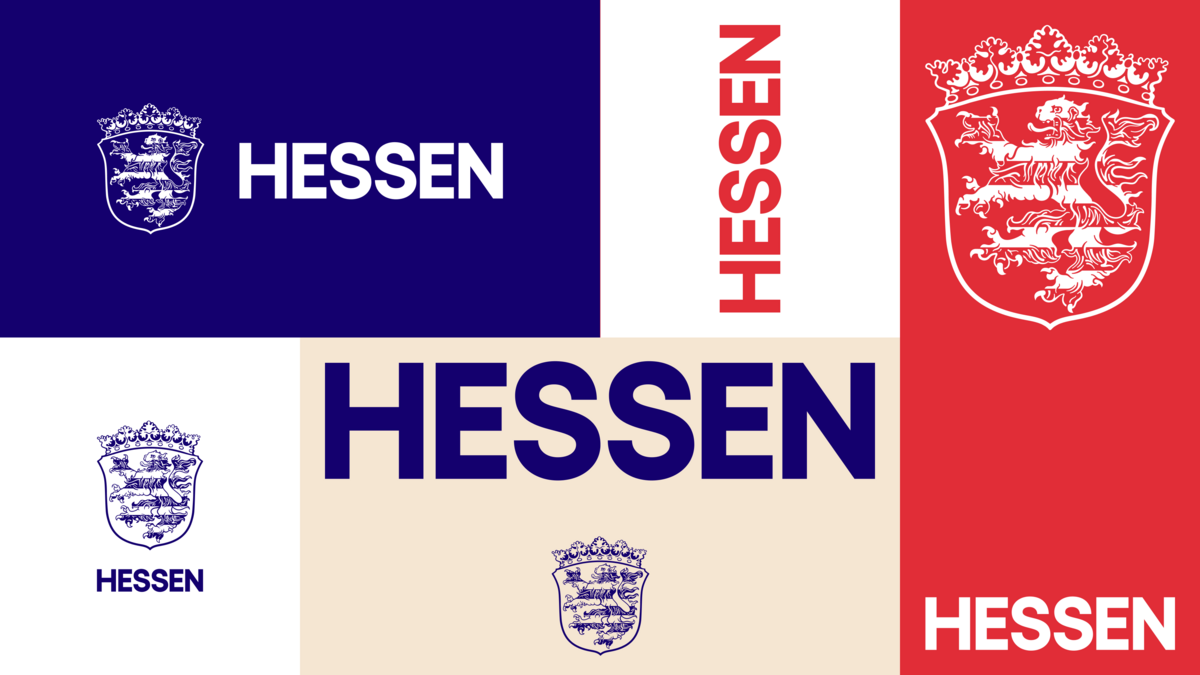
A monochrome version of Hupp’s design is shown elsewhere on the state government’s website: https://hessen.de/Wissen/Der-Hessen-Loewe/Volksstaat-Hessen
View full thread on typo.social
1
0
0
Dan Reynolds
@typeoff@typo.social
New-ish Wuppertaler and a research associate the Johannes Gutenberg University in Mainz. I teach typography and design stuff but spend most of my time looking into late-19th and early-20th-century German typefounding.
typo.social
Dan Reynolds
@typeoff@typo.social
New-ish Wuppertaler and a research associate the Johannes Gutenberg University in Mainz. I teach typography and design stuff but spend most of my time looking into late-19th and early-20th-century German typefounding.
typo.social
@typeoff@typo.social
·
Mar 24, 2026
The German state of Hessen introduced a new logo. The shield/coat of arms/etc. in use since 2004 has been replaced with a retro-futuristic design take on the 1919 design from Otto Hupp. This is an odd choice, as the state’s current borders are different from those a century ago. I’m a bit sad that none of the press materials mention Hupp, either, who was the foremost German heraldic designer of his time, and his work is still in use elsewhere today (e.g., Bavaria’s arms). https://hessen.de/erleben/corporate-design/neues-gewand
13
1
3