Itchy and the Nits at the Thornbury Bowls Club (Mug and Alien Nosejob opening)
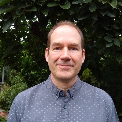
Kerry Nice
@mothlight@fediscience.org
Urban climate scientist/modeller, urban heat, urban systems (health/transport/urban design), weekend gardener. Senior Research Fellow at the University of Melbourne in the Melbourne School of Design. He/Dr. #urbanclimate #climatemodelling
fediscience.org